a lesson on usability courtesy of the Boston Red Sox
 Sitting in the stands near Pesky's Pole on Friday night as the Blue Jays were cruising to an extremely pleasant 16-2 throttling of the Red Sox, I was actually a lot more interested in watching Red Sox fans than the game itself.
One reason? American sports fans are different than Canadian fans; more knowledgeable, more passionate, more vocal, and more likely to be female. (Completely anecdotally, I saw far more women not with men but with other women or on their own at Fenway than I have ever seen at any professional sporting event in Toronto.)
One of the more interesting groups was a gaggle of jock-ular ex-frat boys in front of us. They were betting each other on the action of every half-inning, talking trash to Jose Bautista and fetching each other beer in an almost continuous stream of motion. The fetching meant that every couple of minutes, one of them would come back from the beverage taps with a couple of cups of beer and manage to jump some seat backs while not spilling a drop of liquid.
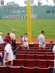
The fact that they could almost always get back into their seats without having their neighbours stand up or move got me thinking about the layout of the seating in that section, as opposed to say the seating at Skydome (sorry, Rogers Centre) or ACC.
For instance, we were sitting in a row with extra leg room, half again the typical width of a row. This meant that people could easily get by us, and us by other people. And the reason this made a difference to our entire section, and not just our row, was that instead of a few super-wide aisles spaced very far apart (think Skydome) our section was criss-crossed with lots of narrow aisles (maybe less than the width of a seat) about every 10 seats. So it was always fairly easy to get in and out of your seat; beer runs and the subsequent washroom runs (um, let's say "trips" instead) did not involve having 15 people gather up their belongings while you were forced to rub your body parts on theirs as you inched by, praying that they wouldn't spill anything on you because you stepped on their foot. Again, if you've been to a Blue Jays game anytime since 1989, you know what I'm talking about.
(And given the Red Sox current payroll, I can't imagine that this seating design has a serious impact on revenue, via a loss of seating.)
I don't know if this is an original feature of Fenway, or a result of the renovations earlier this decade, but it's so simple and so smart that it's breathtaking. It's like the person who thought this up had actually been to a baseball game and realized that people actually do drink and piss during the game.
It wasn't the apex of the experience or anything, but the seating design was something that allowed us and everyone else to focus on the game and have fun and not resent every idiot who no longer forced us to stand up and try not to spill and block the view of everyone behind us. Which is not true of, say, a game at Skydome.
Reality should be a basic principle of design, digital, experiential or otherwise. Don't design to what you think people will do, or think they might do.
Design for what people actually do.
 Post a Comment